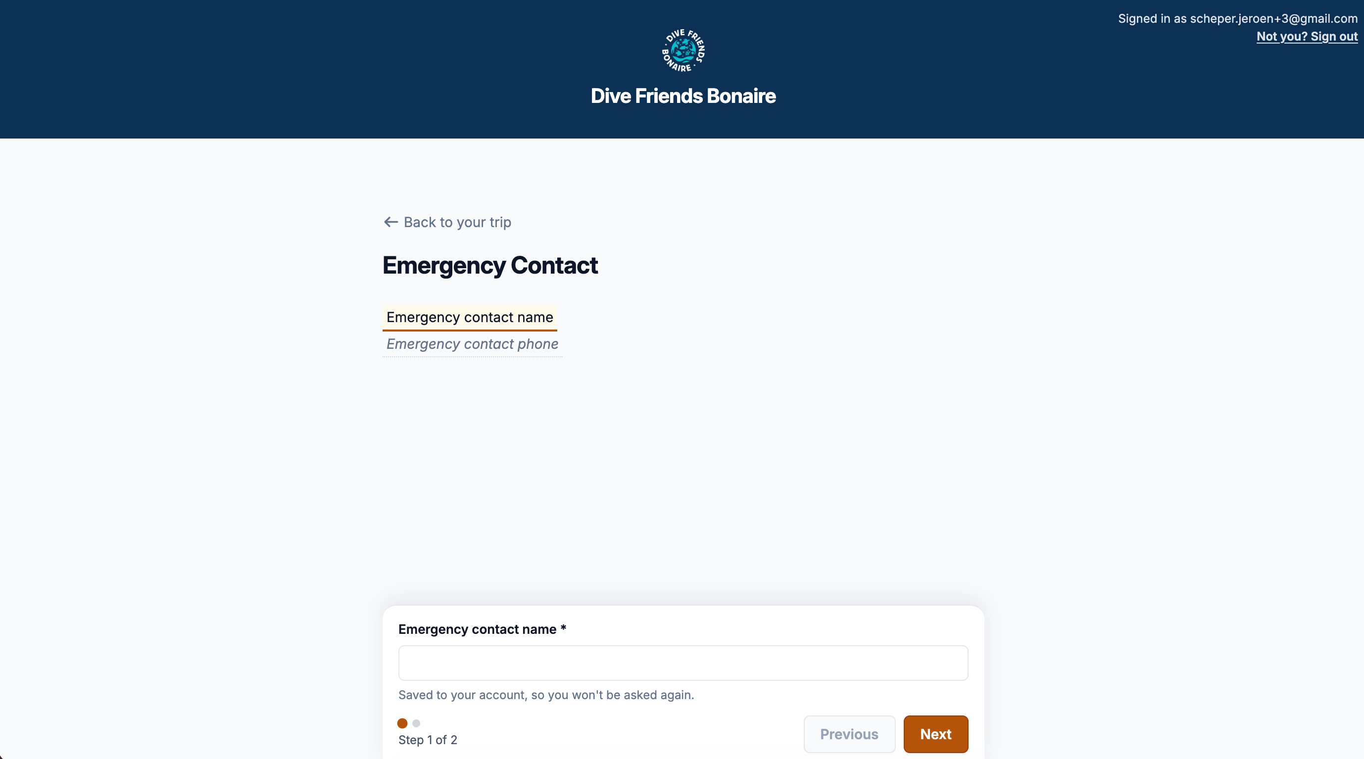
Did this change from a regular input to a form? The UI of this page definitely changed. Im not sure why this changed but the current layout is not user friendly.
See screenshot. The emergency contact name and phone on top feel like input field, but then there is a input field below which i cannot move up. Its coded to stick to the bottom of the page.
Please review the page layout. Personally i would suggest using the white input box on the bottom part and remove the ‘emergency contact name’ and ‘emergency contant phone’ on top completely.