Review & Confirm booking
At a later time, somewhere this week or next i week i will do a thorough inspection of the email/communication flow as we spoke about earlier.
For now;
I have made a test booking for myself under the name Jay Skip. I have received the estimate, looking well.
In the Rental Gear section, when having more than 2 guests, you cannot see the third one. Can you revisit this layout and see how we can make as many guests visible in this view? Or have a different layout that shows/suggests that there is more to see/fill in. I can already see this going wrong where people fill in for the first two guests but not for the other ones because they cannot see it displayed. See screenshot.
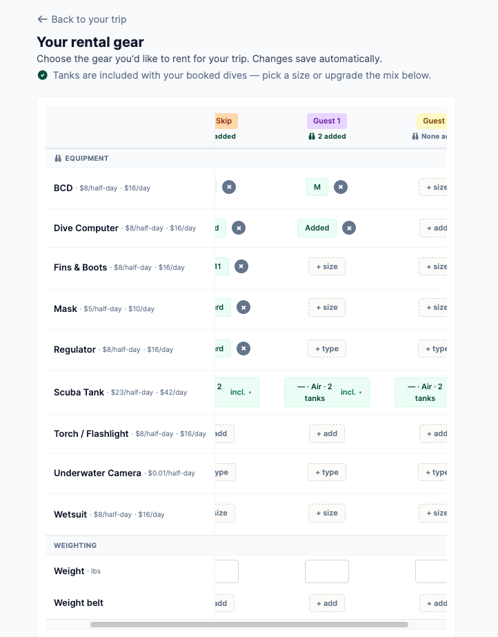
Is page also the place where we want people to fill in the liability and the medical waivers? or will this be sent after the information for each guests has been filled in? Because currently when i click the ‘continue to your checklist’ button. It does not send me to any checklist or forms. I get the following below.
Additionally, isnt it better to do this in a later stage when we have everybody their emails? Since the forms need to be filled in by every participating guest? Im not sure about the flow here yet but it seems to make sense to me.. Thoughts?
Log in to comment and vote
Comments2
David Aidekman
Jul 23
Multiple changes implemented for groups too wide to fit on screen:
"1–4 of 8 guests" counter above the grid so it's obvious more people exist off-screen
‹ › arrow buttons next to the counter
The counter + arrows stay pinned at the top while scrolling down long gear lists
Right edge fades out with a soft shadow whenever more columns are hidden to make it clearer that there is more to the right
Added a spreadsheet-style shadow on the left to show columns in that direction
For customer view specifically (distinct from view shared with business operator):
Added a "Gear chosen for X of Y guests" line above the grid (turns green with a check when everyone's done), so a booker knows they're not finished even if they never scroll
Layout:
Prices moved under each equipment name (e.g. "BCD" over "$7.50/half-day · $15/day") instead of beside it. This makes the left column slimmer, fitting more guest columns on the screen
Jeroen Scheper
Jul 29
I will review this in my thorough communications review